















Featured case study
AI-Driven Storytelling Platform
An AI-powered platform that helps people, families and communities turn their memories into professionally designed, printed books.
Read the case study
Mobile-first websites that read, load and convert well on every screen.
Stack we work in
Trusted by
We design and build responsive websites that adapt cleanly to phones, tablets and desktops from a single codebase.
Layouts, images and navigation are planned mobile-first, so pages stay fast and easy to use wherever visitors arrive. The result is one site to maintain, better engagement and a stronger position in mobile search.
Older sites that shrink rather than adapt: tiny text, horizontal scrolling and buttons too close to tap. We rework layouts for touch screens first.
Maintaining two sites doubles the work and splits SEO signals. We merge them into one responsive site with correct redirects.
Mobile shoppers abandon slow pages and fiddly checkouts. We simplify product pages, filters and checkout for small screens.
If a redesign is coming, we set up a responsive design system so every new page works on every device from day one.
Outcomes
Screenshots and issues across your visitors' most common devices and browsers, taken from your analytics.
Figma layouts for mobile, tablet and desktop, with rules for how components reflow in between.
CSS Grid and Flexbox layouts, fluid type and spacing, responsive images in modern formats, and touch-friendly controls.
Lighthouse and Core Web Vitals scores before and after, measured on mobile network conditions.
Testing on real phones and tablets plus cloud device labs, with accessibility checks for zoom and screen readers.
Layouts and interfaces planned for every screen size from the first wireframe.
Built with
Since 2018 we have delivered 680+ projects for 310+ clients, and 98% of clients keep working with us.
Designers and developers plan each page for small screens first, then scale up.
We test on real phones, tablets and desktop browsers, not just a resized window.
We can make an existing site responsive without starting again, where the code allows.
You own the code and designs, and we support the site after launch.
Figures as of Oct 2026.
Featured case study
An AI-powered platform that helps people, families and communities turn their memories into professionally designed, printed books.
Read the case study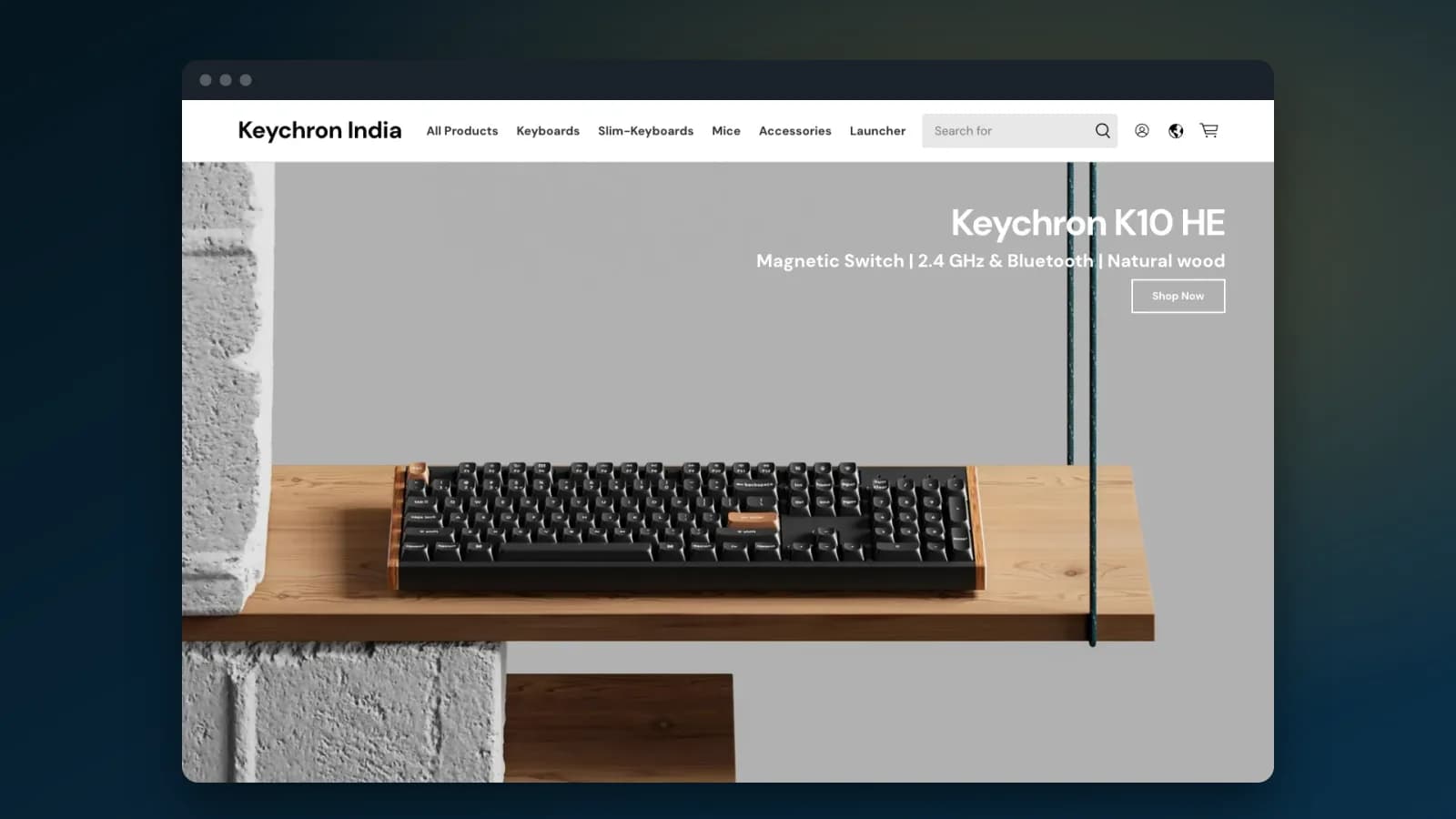 Keychron – Website Redesign & Performance Enhancement
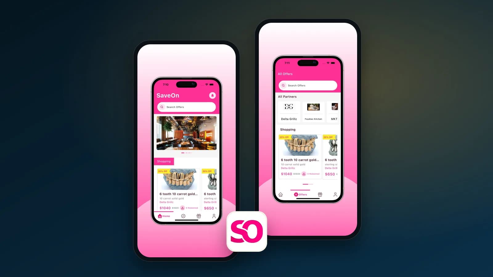 Smart Savings & Exclusive Deals in E-Commerce
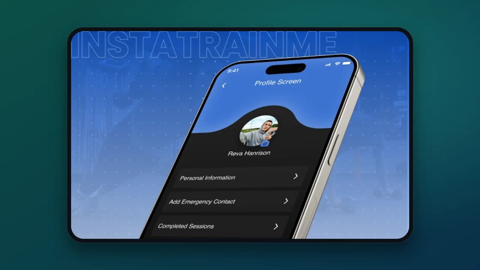 Revolutionizing Health & Wellness with InstaTrainMe
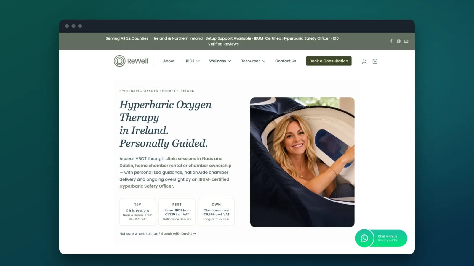 ReWell Website – Wellness & Hyperbaric Oxygen Therapy Platform
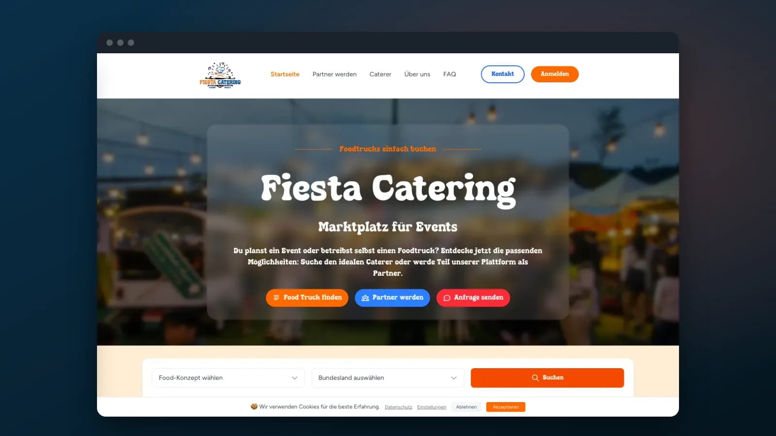 Modern, Responsive, Engaging Catering Website Upgrade
 Building a Print-on-Demand Shopify Integration Platform
Testimonials
Feedback from clients across our web, app and design projects
It has been an incredible experience working with Equitysoft! Their team is professional, responsive, and truly invested in our vision for TreatWalk. They delivered a fast, functional, and beautifully designed app that exceeded expectations. Highly recommended!
We worked with Equitysoft to develop a UX/UI prototype for our startup Wishing Table and got great results! Special thanks to Kushboo for her kind and professional project management. Their post-project support truly stood out. We'd happily work with them again!
We had a great experience working with Equitysoft. The team was professional, timely, and committed to quality. Special thanks to Sachin for his leadership and Kushboo for her excellent support. We look forward to more successful collaborations!
Read every review on Clutch and Trustpilot
We learn your audience, the devices they use, your goals and your competitors, then agree on scope and priorities.
You receive Scope and device priorities
We choose the stack, set breakpoints and wireframe key screens and flows for small screens first.
You receive Responsive wireframes and prototype
High-fidelity designs and a style guide that scale from mobile to large desktop screens.
You receive Responsive design system
Mobile-first front-end development with fluid grids, flexible media and any API or third-party integrations.
You receive Working site on staging
Functional, performance, security and acceptance testing across real devices and browsers.
You receive Test report
Production setup, launch monitoring and ongoing updates, security fixes and performance tuning.
You receive Live site and support plan
Tech stack
Frontend
Languages
CRM, commerce and CMS
Testing and quality
Other tools
Engagement
Cost depends on the number of templates, how far the current code can be reused, interactive components such as menus, filters or tables, and the range of devices you need to support.
Rebuild an existing site's templates so they adapt to every screen.
Design and build a new mobile-first website on WordPress, Shopify or a custom stack.
A short, focused engagement to fix the worst mobile problems on key pages.
Get started
Let's create a responsive website that delivers an exceptional user experience across all devices and screen sizes.
Responsive web development refers to the approach of designing and coding websites so they adapt smoothly to various screen sizes—smartphones, tablets, laptops, and desktops. At Equitysoft Technologies, we build mobile-first, responsive websites that deliver a consistent and optimized user experience across all devices.
A responsive website ensures your business is accessible on all devices, increasing engagement and lowering bounce rates. It enhances user experience, boosts search engine rankings, and reduces the need for multiple versions of your site. With Equitysoft Technologies, you get SEO-friendly and device-agnostic web solutions that keep users engaged.
The cost of designing a responsive website depends on project scope, number of pages, features, and customization. At Equitysoft Technologies, our responsive design packages are flexible and scalable, starting from cost-effective basic websites to complex custom solutions. Contact us for a tailored quote. As a guide, business websites start from about $2,000 and custom web apps usually cost $10,000 to $50,000 (USD).
Yes, we offer full launch support and post-launch maintenance services. From technical troubleshooting and security updates to performance monitoring, Equitysoft Technologies ensures your responsive website runs smoothly long after it goes live.
Absolutely. Google prioritizes mobile-friendly, responsive websites in its rankings. A responsive layout improves loading speed, user engagement, and bounce rates—all of which are key SEO metrics. Our development approach ensures your site is search engine optimized from the start.
Mobile-friendly sites display correctly on mobile devices but don’t adapt dynamically to screen sizes. Responsive web design, however, adjusts smoothly to all devices. At Equitysoft Technologies, we specialize in responsive design to future-proof your website across all platforms.
The mobile-first approach means designing for smaller screens first, then scaling up for larger devices. It ensures performance and usability on mobile, which is critical today. Our team follows this mobile-first strategy to ensure fast, optimized, and scalable web experiences.
Responsive design uses fluid grids to adapt to any screen size, while adaptive design uses fixed layouts for specific devices. Responsive is more flexible and future-ready. At Equitysoft Technologies, we recommend responsive design for better scalability and long-term usability.
Often, yes. If the site's code is reasonably structured, we can rework its CSS and templates to adapt to all screens. If the layout is built with fixed widths or tables throughout, a rebuild of the templates is usually faster and more reliable. Our audit tells you which applies before you commit.
We start from your analytics to list the devices, screen sizes and browsers your visitors actually use, then test on real phones and tablets and on cloud device labs for the long tail, including Safari on iOS and Chrome on Android.
It depends on the number of templates and how much existing code can be reused. A fix-list sprint on key pages is the quickest option; a full rebuild of all templates takes longer. Our audit ends with a timeline and a fixed quote.
You do. The Figma files, front-end code and any CMS templates are handed over to your accounts at launch.
We deliver responsive web design solutions that ensure your website looks and performs flawlessly across all devices and platforms.
Responsive Website Design
Our team crafts visually stunning and highly functional responsive website designs using modern technologies like HTML5 and CSS. Each website is built with cross-device compatibility in mind, ensuring a consistent experience on smartphones, tablets, and desktops. Our focus on SEO-friendly design also improves your search visibility and user engagement.
Responsive Website Development
As a trusted responsive web development company, Equitysoft Technologies builds scalable and intuitive web solutions that adapt to all screen sizes. Using a mobile-first development approach, we ensure every element of your website—from layout to functionality—is optimized for speed, usability, and conversions.
Landing Page Optimization
A great landing page makes all the difference. Our landing page optimization services enhance both design and performance to keep your visitors engaged and drive action. From improved load times to compelling visuals and CTAs, we make sure every page supports your marketing goals.
Responsive eCommerce Design
Today’s shoppers expect a smooth experience across all devices. Our responsive eCommerce design solutions are tailored to provide your customers with easy navigation and checkout experiences, whether they're browsing on a phone, tablet, or laptop. We combine user-centric design with responsive themes to increase conversions and customer satisfaction.
We utilize modern technologies and design systems to craft responsive, accessible, and visually engaging web experiences across all devices.
Responsive toolkit
We deliver responsive web design solutions for a wide range of industries, empowering businesses to reach their audiences and provide smooth digital experiences on any device.
Industries
A systematic approach to transforming your vision into reality. The eight stages: Requirements (Discovery & Planning), Planning (Strategy & Architecture), Prototyping (Initial Design), UI/UX Design (Visual Design), Development (Implementation), Testing (Quality Assurance), Deployment (Launch & Release) and Maintenance (Support & Updates).
Requirements Gathering
Understanding your vision and goals. We begin by conducting thorough research and analysis to understand your business needs, target audience, and project objectives. This phase involves:
Project Planning
Creating a roadmap for success. We develop a comprehensive project plan that outlines:
Prototyping
Initial Design and Concept Validation. We create interactive prototypes to visualize the application flow and validate concepts:
UI/UX Design
Creating beautiful user experiences. Our design team creates visually appealing and user-friendly interfaces:
Development
Building your solution. Our experienced development team brings your vision to life:
Testing
Ensuring quality and reliability. Rigorous testing ensures your application works flawlessly:
Deployment
Taking your product live. We handle the launch process with care and attention to detail:
Maintenance
Ongoing support and evolution. We provide ongoing support to keep your application running smoothly:
Transform your business with our full spectrum of digital services and innovative solutions.
Web Development
Custom web solutions with modern technologies and responsive design
UI/UX Design Services
User-centered design solutions that delight and engage your audience
AI Development
Advanced AI solutions to automate and enhance your business processes
Mobile App Development
Build innovative apps that drive transformation and engage customers.
Recent projects from across our web and app portfolio
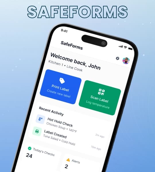
SafeForms – Food Safety Management App for Commercial Kitchens
SafeForms is a modern food safety app designed to simplify food safety workflows and kitchen safety processes for commercial kitchens and food service environments.
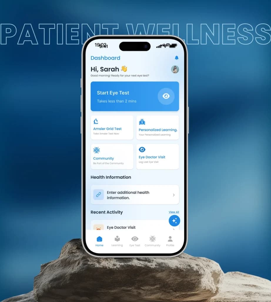
Patient Wellness App – Eye Health Assessment & Tracking Platform
The Patient Wellness App is a web-based platform developed to support eye health assessment and ongoing wellness tracking for patients.
Retail and deals
Health and fitness
Hospitality
Book a call with our team. We will review your current site on mobile and outline what a responsive rebuild involves.